I came across an article a while back that covered replicating an animated action menu in Compose. It was an excellent read but the final animation felt like it was lacking some nuance in my eyes. I had some thoughts on improvements to make the motion sparkle so I decided to make a project of it and share my results.
What I thought could be improved
- Animation origin point
Expand the menu from the touchpoint instead of an arbitrary point. This would feel more reactive and natural. - Easing settings
The source post uses a linear animation (via the default easing inKeyFrameSpec{}) which doesn't feel very natural - Icon animation jank #1
The individual icons are only added to the layout once there's sufficient room. This leads to jarring single-frame transitions where an icon suddenly appears in the expanding view. Even more noticeable, the text jumps around as the line-break point shifts.
- Icon animation jank #2
The icon is displayed at less than full-size if there's not enough room at that particular width. See the half-sized heart icon in this framegrab from the source post animation:

- Reduce visual noise
The moving icons add extra visual noise to the transition. Sometimes, less is more. I'd like to try a version where the icons are in-place and revealed by expanding menu window.
Implementation points of interest
Animate left and right positions separately
Separate state vars for the left and right positions allows the menu to expand at different rates on each side. This is important for spring-based animations since one side may finish before the other, depending on the position of origin point.
val leftEdgePositionDp: State<Dp> = transition.animateDp(
	transitionSpec = {
    	if (this.targetState == EnterExitState.Visible) {
			getPositionAnimationSpec()
		} else {
        	tween(
            	durationMillis = 200,
                easing = EaseIn
			)
        }
	},
    label = "left edge position",
) {
	if (it == EnterExitState.Visible) 0.dp else baseOffsetDp
}

val rightEdgePositionDp: State<Dp> = ...getPositionAnimationSpec() is a simple utility function that I used to compare different animations quickly.
Separate menu background and content into different composables
This component structure is used to create a Reveal animation where the menu background "reveals" the content as it expands. The only moving piece will be the background surface which cuts down on visual noise.
The menu size and position is calculated using the left and right edge state variables and assigned via Modifier.
Surface(
	modifier = Modifier
    	.requiredWidth(rightEdgePositionDp.value - leftEdgePositionDp.value)
        .offset(x = leftEdgePositionDp.value + offsetAdjustment)
	...
) {
	// No content for you, only background
}For the menu content, we use the clipRect function within the ContentDrawScope of the lambda passed to Modifier.drawWithContent() to set the area of the menu content which will be drawn.
Box(
	modifier = Modifier.drawWithContent {
    	this.clipRect(
        	left = with(density) { leftEdgePositionDp.value.toPx() },
			right = with(density) { rightEdgePositionDp.value.toPx() },
            top = 0.0f,
            bottom = size.height
		) {
            (this@drawWithContent).drawContent()
		}
	}
) {
	content()
}Easing
I've mentioned using a Spring-based animation spec and, indeed, that was my initial intention. I thought the effect of the left/right sides animating at different speeds and completing at slightly different times would look neat (which it does!). However, the Material 3 design docs recommend an Emphasis animation spec so I ultimately opted for that instead. I compared the two and liked them fairly equally but my appreciation for finely-crafted design systems won out.
I won't get into the Principles of Motion weeds here but, suffice to say, linear animations should normally be avoided for any animation beyond alpha changes.
One curious thing here is that I wasn't able to find a direct reference to the Emphasis animation spec so I created my own based on the bezier curve values in the docs. It probably exists though so let me know if I've just missed it somewhere!
@Composable
private fun M3EmphasisSpec(): TweenSpec<Dp> =
    tween(
        durationMillis = 400,
        easing = CubicBezierEasing(0.05f, 0.7f, 0.1f, 1.0f)
    )
Performance check
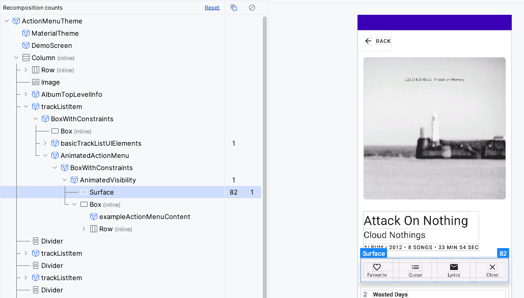
An important part of any UI exploration!This is a pretty simple animation so I just did a quick check of the recomposition counts via the Layout Inspector and it looks good! If it were more complicated, I'd check the profiler results and HWUI rendering stats.
Key points here are the number of recompositions on the Surface and the Box. The Surface has a expectedly high number which corresponds to the animation ticks of the left and right edge state values. The Box containing the menu escapes this high number of recompositions. It makes use of Modifier.drawWithContent which only affects the draw phase.
Further considerations
There was a number of architectural directions I could have gone in for this component. For instance, should the component be structured with a rigid action item system that only takes in a list of Icon, caption, action pairings or should it be implemented agnostic of the content? I mixed the two by using a hard-coded round-rect for the menu background but leaving the contents itself up to the caller. This makes the most sense for a small demo project like this but I would lean towards the stricter option for a larger project with multiple downstream teams.
Results
Here's a video of the final animation:
To recap, here's the main achievements:
- Use better easing functions to give a more natural animation
- Avoid janky animation frames where the content is weirdly placed by making the content statically sized
Here's the original animation for comparison:
Thanks for reading!
I could spend a near infinite amount of time tweaking the animations but I've achieved my goals here. It was a fun project and the resulting animation feels more fluid and natural to me.
Bonus content
I made a quick mock-up of an app to show an in-situ usage of a component like this: