I created an app years ago to log business trips in my personal vehicle for tax purposes (my partner and I operate a small ice cream shop). It was written before Compose had hit the scene so it was due for a refresh and I was curious to try a made-for-Compose architecture that I had read about from the folks at Slack.
I also wanted to throw on a new coat of paint so I gave it an old-school terminal patina. Partially for the nostalgia vibes, and partially because I wanted to explore how well terminals work with the UX concept of thumb reachability (surprisingly well!).
It's up on the Google Play Store as a free download here or you can check out this screen recording video to give you an idea of what it looks like:
Recording a trip and viewing all trips in Trtl
Circuit Architecture
One of the main drivers for this rewrite was Circuit. It's an architecture being developed and currently used in production by Slack. The premise that really intrigued me was the use of the Compose Compiler library to manage application state as well as the UI state.
Overall, I think Circuit delivered on its promises. The concept makes a lot of sense and worked well in practice. The documentation is thorough and includes clear examples for the basic use cases. I would have appreciated being given a more granular understanding of the architecture from the docs but that's just as much on me since I didn't explore the source code too deeply.
For more information on Circuit, the docs can be found here. Zac Sweers and Kieran Elliott also give a great overview in this talk.
Gimme that CRT fuzziness
Curious about how the CRT look was accomplished? This was a shoulders-of-giants adventure. I had looked for examples of retro terminals when I was first brainstorming the project and I discovered that the Microsoft Terminal project had samples showing the look I was aiming for. They were powered by shaders which meant they'd likely be relatively easy to apply to an Android project. This example in particular was perfect: https://github.com/microsoft/terminal/blob/main/samples/PixelShaders/Retro.hlsl
With a bit of porting from HLSL to AGSL, I was able to apply the shader to my app. Just to keep things simple, I only ported over the Scanline portion of the shader. I tweaked some numbers for my use case, combined it with a standard Blur RenderEffect and that was all it took!
val shader = RuntimeShader(CONSOLE_EFFECT) // port of Retro.hlsl
val compositeRuntimeEffect = RenderEffect.createChainEffect(
  RenderEffect.createRuntimeShaderEffect(
    shader,
    "contents"
  ),
  RenderEffect.createBlurEffect(1.5f, 1.5f, Shader.TileMode.CLAMP),
)
And here's the code applying the composite shader to the UI:
Box(modifier
  .graphicsLayer {
    renderEffect = compositeRuntimeEffect.asComposeRenderEffect()
  }
) { /* Content */ }
Caveat: I have to say that if this were anything other than a personal hobby app, I would strongly advise against this! Those old CRT monitors gave us that signature fuzziness for free. This method applies a blur across the entire screen to get it which is definitely going to affect performance. Luckily, I'm not relying on any smooth animations so this isn't a problem visually. Beyond performance, there's also a clear impact on the legibility of the text. But hey, it looks accurate! I can almost hear that CRT hum.
Figma
I'm a big proponent of Design Systems so I want to highlight some of the Design System practices that can be useful even in small, informal projects like this.
Components
After sketching out some UIs on paper, I formalized the components, text styles, colours, etc in Figma. This allowed me to experiment with colour, text sizes, etc quickly during the design phase. Further down the pipeline, they also made the spacing requirements, etc much clearer when implementing the components in code.
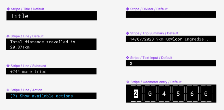
Mockups
The aforementioned components made it a breeze to fabricate mock-ups for the various flows I needed. To make things even easier, I created a base mock-up with an AutoLayout container for content. Now all I have to do is paste components into the auto-layout and it takes care of arranging them correctly into a bottom-anchored, vertical stack.
I was even able to simulate full flows via Figma's prototyping functionality! This was so so helpful when feeling out the various flows.
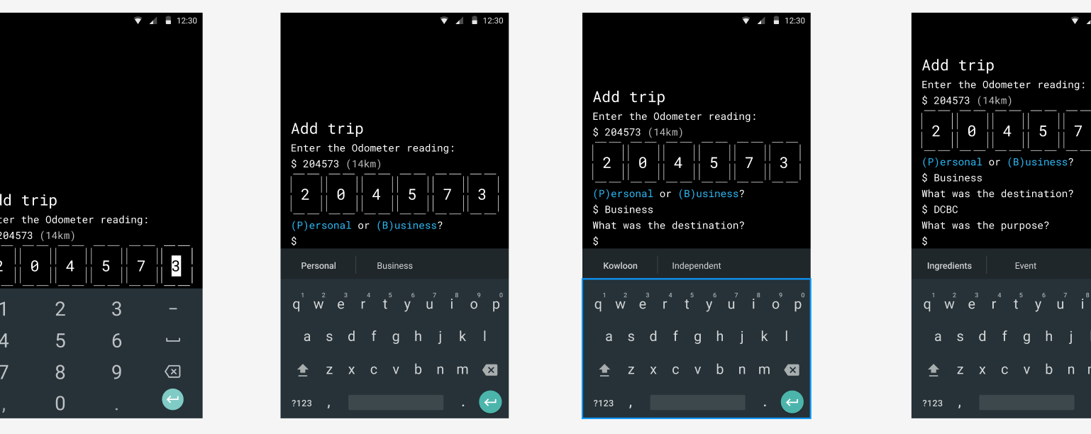
How about that odometer input control?
This was one of the more difficult tasks in the project. I spent a lot of time hacking away at the standard Android input field to get it to look the way I wanted only to be stymied by cursor handles that cannot be circumvented.
Ultimately, I spent yet more time reading through the source code for BasicTextField, CoreTextField, etc until I understood it well enough to create my own custom text input component from scratch. Much respect to the devs who created the core composables!
I went the custom composable route because editing and overwriting specific characters in a string is not the primary use case for a TextField. It can do it but it's not what you would call frictionless. In this case, the UX benefits of a custom control far outweighed the time required to design and implement it.
Only the last one or two digits will change for the majority of my trips so I wanted large tap targets that would make selecting individual digits easy. Once the digit is updated, selection moves to the next digit in the odometer value until it gets to the end so that I can smoothly type in the new sequence.
While I'm here, I ran into some other frustrating issues around text. Namely, the lack of control over the keyboard. You may notice some single-frame flickering during some of the flows when the regular text input is swapped for the odometer, screen changes, etc. I know there's some work being done on the TextFields so I'm hopeful that they are a bit easier to work with in the near future.
Thanks for reading!
That's it! I hope this was useful or at least interesting. It was a fun project for me and particularly satisfying to create a custom tool for myself that will make a near daily task easier and more delightful.